Responsive Web Design - What is it & Why use it?

As the new web designer of Xenyo, one of my first tasks was to re-design the company website. Our main concern was to make the site mobile friendly, so I looked into a concept called Responsive Design.
What is Responsive Design?
From Wikipedia:
"Responsive Web Design (RWD) essentially indicates that a web site is crafted to use Cascading Style Sheets 3 media queries, an extension of the @media rule, with fluid proportion-based grids (which use percentages and EMs instead of pixels), to adapt the layout to the viewing environment, and probably also use flexible images. As a result, users across a broad range of devices and browsers will have access to a single source of content, laid out so as to be easy to read and navigate with a minimum of resizing, panning, and scrolling."
Before responsive design, multiple design variations of a single site (iphone, ipad, andriod, desktop, etc) would be developed to accommodate different mobile devices. The responsive design approach will only require one site as the it will respond based on the user's browsing environment (screen size, platform, orientation). If you are on a laptop or desktop right now, try resizing your web browser by clicking onto and holding the bottom right corner, then drag it left and right. The website will change form according to the width size of your browser, pretty cool yeah?
Why use Responsive Design?
With mobile browsing expected to outpace desktop by 2013-2014, The mobile market is a important factor to consider for all online companies alike. 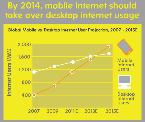
As new mobile and tablet devices are released every year, creating an optimal design for every new device becomes practically impossible, which is why we adpated to responsive design. The major tangible benefit of a well implemented responsive design is that it is future proof. The settings will be optimal on a 4.5in mobile device or 9.5in tablet. Once completed just let the site run without worrying about online reputation or losing potential clients due to a poor mobile experience. This also means you'll save a bundle of time and money as you won't need to re-developing a new mobile site every time a popular device enters the market. Best of all it will put you ahead of your competition, as responsively designed sites will provide fluid functionality and in return it will gain trust and respect from your clients.
In short, I believe responsive web design is the way forward. Instead of creating several disconnected sites that try to accommodate for the infinite amount of new devices, why not just create one that has the ability to adapt to them all?
Below are a few good examples of websites that have adapted to responsive design: